2009 Baseball Icons Preview
![]() The Beckett Blog has a first look preview of 2009 Baseball Icons, a new product that is going to be released this upcoming season, which is set to come out in July.
The Beckett Blog has a first look preview of 2009 Baseball Icons, a new product that is going to be released this upcoming season, which is set to come out in July.
According to the blog, each 10-pack box will have five serial numbered inserts and parallels, including two Letterman cards, two memorabilia cards and one auto.
Each 12-box case will include two Lettermen autograph cards numbered to 99 or less and one Upper Deck 20th Anniversary memorabilia card.
The standard set will include 100 regular cards, 30 rookie cards numbered to 999 and 30 autographed rookies numbered to 600 or less.
Also included will be Celebrity Lettermen and Immortal Lettermen SignaturesSigned Lettermen patch cards from active and retired stars.
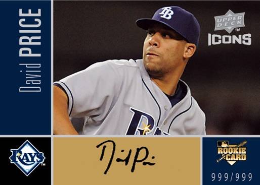
One of the preview pictures released was a David Price auto to get all the prosepcting, Tampa Bay and rookie collectors excited.
 What do guys think of the design? There are pictures available on the Beckett site that I linked at the top. It’s a very basic design and doesn’t add anything that I haven’t seen before. Granted, that’s difficult these days with baseball cards because so many designs have been used, but I’ve just been looking for that wow factor when it comes to new sets.If I’m rating my wow factor from one to five, I’m going with a 2. I don’t hate the cards, but i don’t see myself looking for anything out of this more than a Jeter card. Also, if the set is called Icons, why is there an auto of David Price? I wouldn’t put him at that level.Here are a few more pics:

Sign up for the Card Chat newsletter here!


Where does the “O” come from in Cal Ripken Jr.?
(because it certainly isn’t the script from Baltimore or Orioles)
This set looks like a stinker. I think I’ll be staying away from it!
Based on what I see here, they are pretty unattractive. On a wow of 1-5, no more than a 2 from me. I’m good for a blaster box at most.
I think the “O” is for Iron Man. Weird card to display. Either display the whole thing Upper Deck or don’t do it. Couldn’t do an “I” instead? Makes me wonder. As for the set, it is a lot of blah wrapped around a few ahhh’s. There are too many sets out there. I feel like an archaeologist sifting through grains of sand to find a product worthwhile. Sadly, those grains of sand seem to multiply every year.
I’m pretty sure that the Ripken is a white “I” on an orange background.
I’m sitting here staring on the O now.
It’s an O.
The O has black outlines around it, which leads me to believe that it’s on O and not an I.
I agree with Chris. There are too many sets out there. Too many sets by the same people.
Doesn’t it resemble UD Documentary?
I’m sure it’ll be full of “Icons” like Fukudome and other examples of mediocrity, all while not including an arguable Yankee icon like Andy Pettitte (he deserves to be included with Jeter, Posada and Rivera in a set called Icons). Most likely I’ll just buy the singles from this and call it good.